
A more consistent, cohesive, and intuitive cruise experience
Time frame: 2019–2020
Role
As Principal UX Designer, my role was to lead the creative process, collaborate closely with product, dev, and other cross-functional partners, frame the project goals and perspective, audit our current experiences, diagram user flows, document and explore content hierarchy and responsive components, define and document detailed specs for the MVP solution, and ensure we met the dynamic requirements of the project to learn and improve upon the holistic experience for the user.
Problems to solve
As a user,
- It is difficult to scan and understand the content displayed in the sailing cards on search results.
- It is difficult to access and review the itinerary before and while selecting my cabin.
- It is impossible to access experiential content from the sailing card relevant its destinations (ports of call), cruise-line, and cruise-ship on search results.
- It is difficult to access and review a playback of my sailing on cabin selection on mobile.
Legacy issues
- Content hierarchy and responsive design patterns are holistically inconsistent.
- Price display is holistically inconsistent, and specifically on mobile, challenging to access and review.
Observations
Research
A comparative research study was conducted to help gather insights and learn what, why, when, where, and how content is important to customers in the shopping experience.
What helps the customer feel confident in their decisions before booking their cruise?
- Price transparency.
- Inspirational and experiential content.
- Quality deals and offers.
- Reviews and ratings.
OpinionLab feedback
What were a few key friction points for customers?
- Inability to quickly compare ports of call between search results.
- Accessibility to ports of call experiential content.
- Accessibility to onboard experiential content.
- Accessibility to the deck plans from cabin selection step 1 → step 4.
Internal experience audit
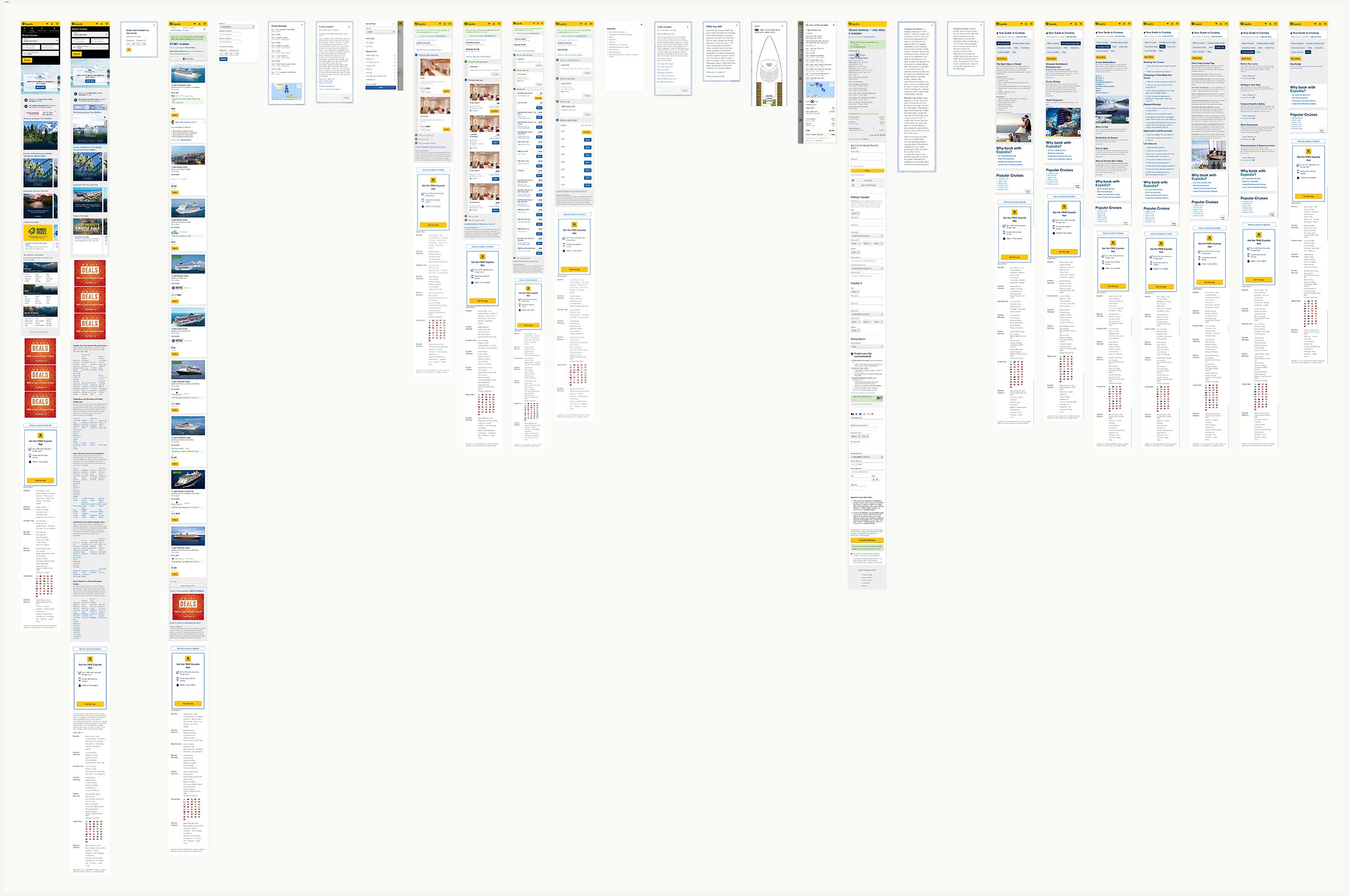
A comprehensive experience audit, content audit matrix, and a detailed full-stack flow was conducted before our MVP strategy was defined. Due to underlying data sensitivity, below is a limited example from that audit relevant to this project:
Current mobile experience (early 2020)

Current desktop experience (early 2020)

Current sailing card experience (early 2020)
Competitor experience audits
A comprehensive collection of experience audits was conducted before our MVP strategy was defined. Below are a few samples from that audit relevant to this project:

A few competitor audits
Distinctions and patterns
- Content hierarchy is a bit of a hot mess.
- Ports of call formatting varies (ex:[City, Country] or [City]).
- Minimal itinerary (ports of call) on search results sailing card followed by a more detailed and informative itinerary on the following page ∕ view.
- Access to experiential content on almost every step from search results → cruise review or checkout.
- Generally consistent playback sailing card on subsequent pages.
Hypotheses
Search results
If we display the core required content on sailing cards in a coherent and consistent way, then customers will more easily compare and find the sailing that is right for them, resulting in an increase in funnel progression from search results → cabin selection.
Playback on cabin selection
If we display a playback sailing card on cabin selection, which includes itinerary, cruise–line, and cruise–ship content, then customers will be able to reference their sailing selection as they make decisions on cabin selection, resulting in an increase in funnel progression from cabin selection step 1 → 4.
Cabin selection steps 1 → 4
If we display step headlines states, such as inactive, active, and complete, then customers will be properly informed about available promotions when building their cruise vacation, resulting in an increase in funnel progression from cabin selection step 2 → 3.
Metrics for success
- Increase in funnel progression from search results → cabin selection.
- Increase in funnel progression from cabin selection step 1 → 4.
- Increase in funnel progression from cabin selection step 4 → checkout.
- Interaction with the “See itinerary” link on search results and cabin selection.
- Interaction with the “See all [#] offers” link on search results and cabin selection.
- Interaction with cruise–line and cruise–ship links on cabin selection.
Scope and considerations
- This is phase 1 of a 3 phase product release.
- Brand/POS.
- Platforms and devices.
- UITKv2 styles and components → UDS styles and components.
- Usability.
- Accessibility.
- Scalability.
- Performance.
- Localization.
User flows
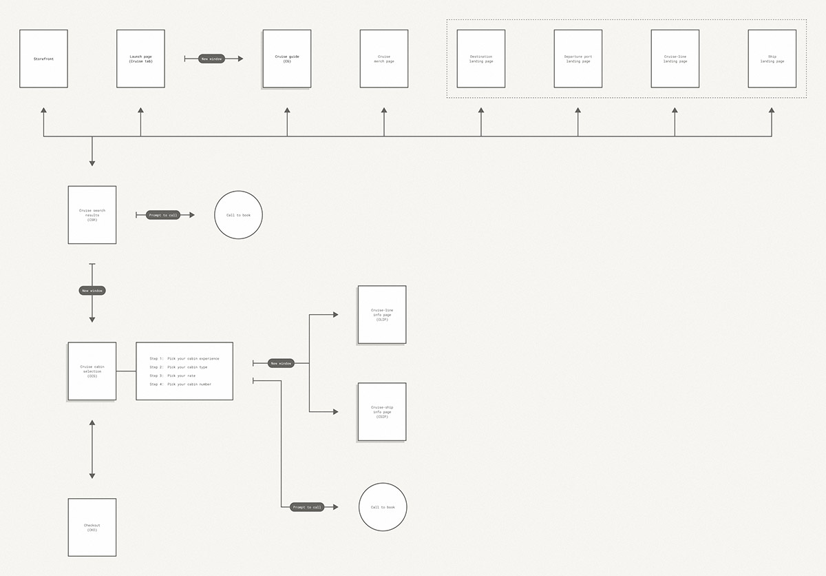
Expedia.com
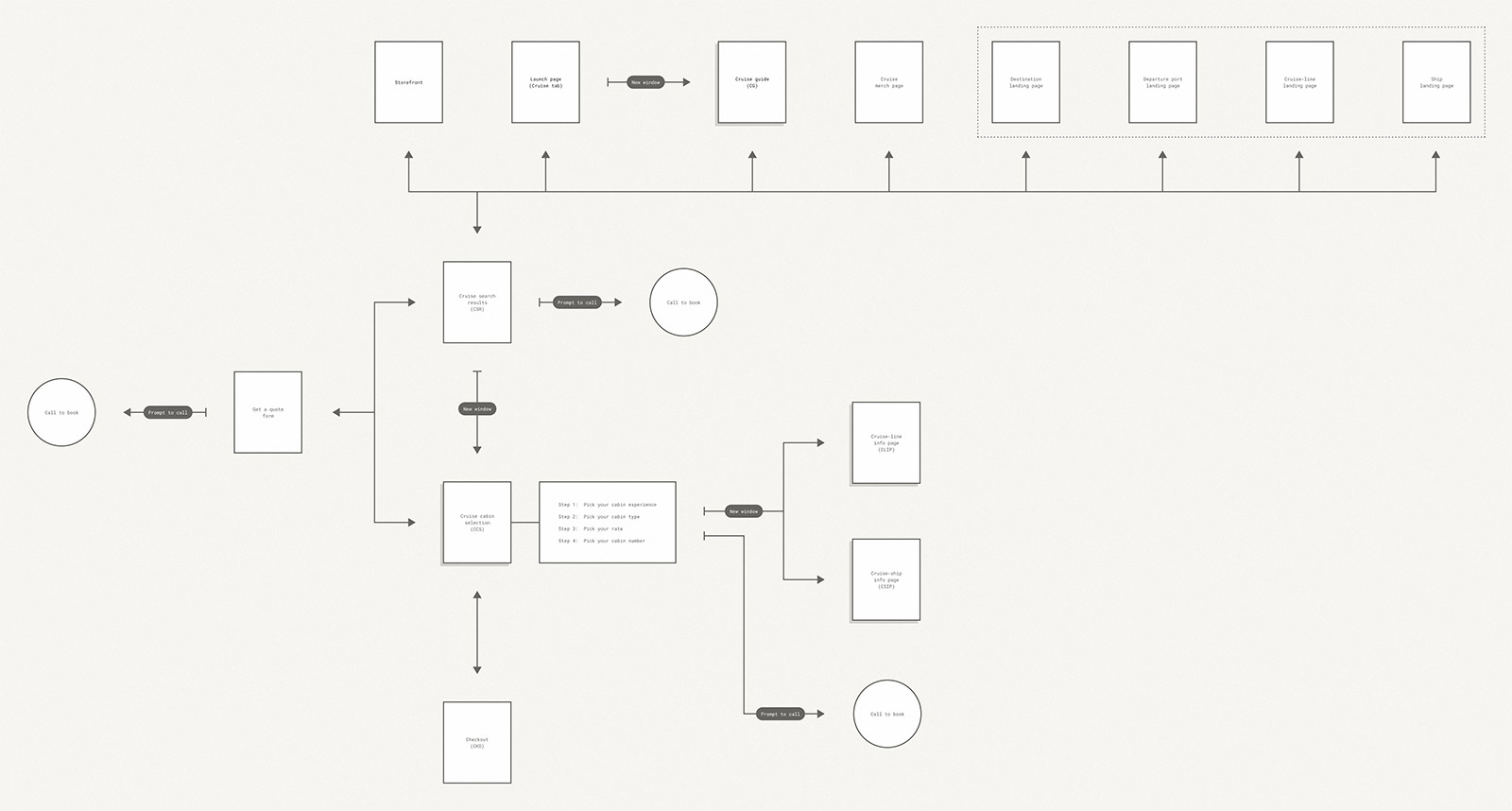
Expedia.ca
What is the purpose of each view?
A comprehensive page/view purpose matrix was created before our MVP strategy was defined. Below are samples from that matrix relevant to this project:
Destination landing page
This page is a side door to Expedia Cruises where customers can either begin their search for their cruise vacation or can discover, be inspired, and compare unique, exclusive, and/or brand cruise offerings & deals specific to a destination.
Ports of call landing page
This page is a side door to Expedia Cruises where customers can either begin their search for their cruise vacation or can discover, be inspired, and compare unique, exclusive, and/or brand cruise offerings & deals specific to a port of call.
Cruise-line landing page
This page is a side door to Expedia Cruises where customers can either begin their search for their cruise vacation or can discover, be inspired, and compare unique, exclusive, and/or brand cruise offerings & deals specific to a cruise-line.
Cruise-ship landing page
This page is a side door to Expedia Cruises where customers can either begin their search for their cruise vacation or can discover, be inspired, and compare unique, exclusive, and/brand cruise offerings & deals specific to a cruise-ship.
Cruise search results (CSR)
This page shows available cruise itineraries based on a customers search criteria and provides levers by which to narrow down cruise itineraries based on what matters most to them until they have discovered the chosen a sailing.
Cruise cabin selection (CCS)
This page is a summary playback of the selected sailing, as well as sequential decisions that need to be made as the customer progresses through the cabin selection flow.
CCS - Step 1: Pick your cabin experience
This view encourages comparison of available cabin experiences inside, oceanview, balcony, or suite so that a customer can confidently choose the right cabin experience for them.
CCS - Step 2: Pick your cabin type
This view encourages comparison of available cabin types so that a customer can confidently choose the right cabin type for them.
CCS - Step 3: Pick your rate
This view encourages comparison of available rates types individual or bundled offers/promotions that apply to the chosen cabin type so that a customer can choose the right rate type for them.
CCS - Step 4: Pick your cabin number
This view encourages comparison of available cabins across decks so that a customer can choose the right cabin for them.
Sailing card content hierarchy
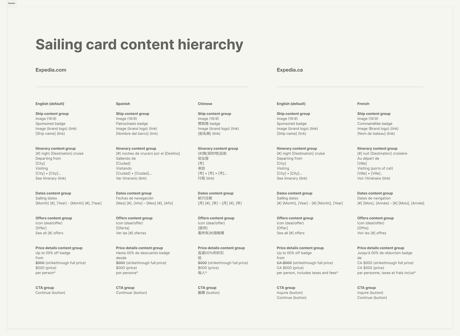
Sailing card content hierarchy
Explorations

Sailing card explorations

Playback sailing card explorations
Discovery and booking experiences
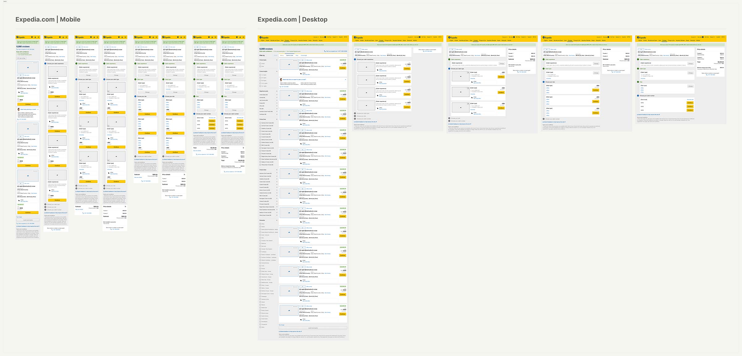
Sailing card explorations
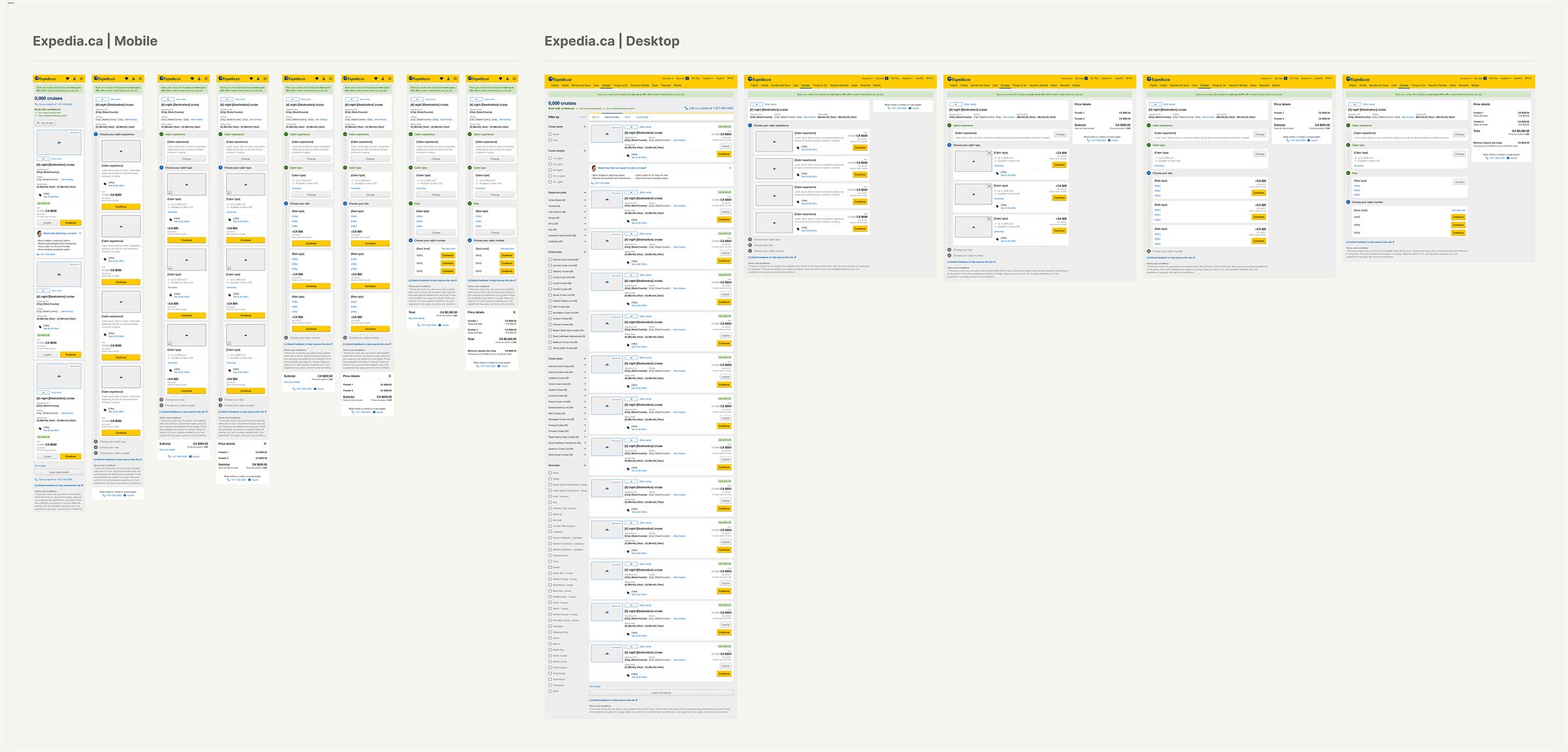
Playback sailing card explorations
Responsive patterns
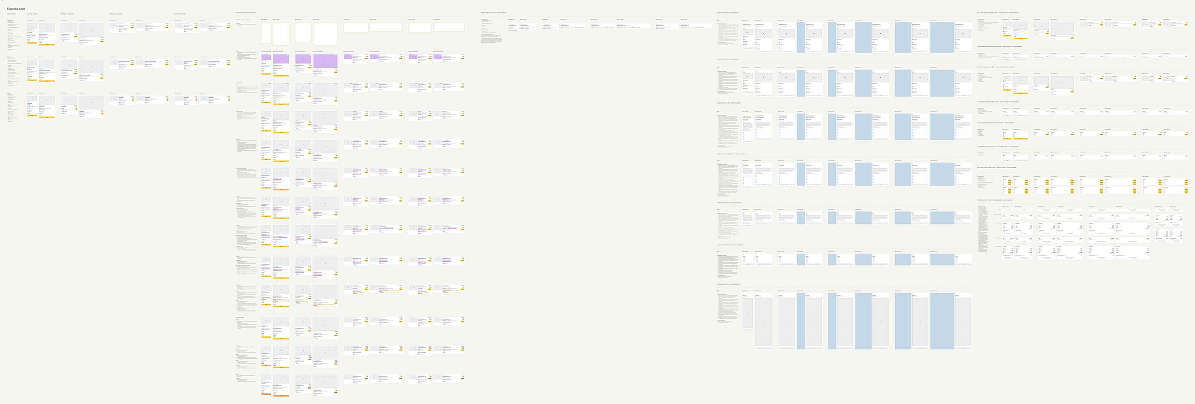
Expedia.com
What’s changing on search results?
Sailing card
- Content hierarchy.
- Formatt/styles.
- Introduced return dates.
- Introduced ports of call with link to itinerary.
Dialog views
- Introduced a new itinerary view.
- Introduced a new multi-offers view.
What’s changing on cabin selection?
Page-level and steps 1 → 4
- Introduced a new playback sailing card.
- Introduced updated step headlines for both inactive, active, and completed states.
- Formatt/styles of the step 1 cabin experience modules.
- Formatt/styles of the step 2 cabin type modules.
- Formatt/styles of the step 3 rate type modules.
- Formatt/styles of the step 4 cabin number module.
- Updated styles and text on CTA’s on steps 1 → 4.
Dialog views
- Introduced a new itinerary view across steps.
- Introduced a new multi-offers view on steps 1 and 2.
- Introduced a new amenities view on step 2.
- Introduced a new offer view on step 3.
- Introduced a new deck plan view on step 4.
What did we learn?
We saw major increases in user progression, engagement, and conversion. All improvements had substantial impact to the user experience and business.
- ~28% increase in progression from search results → cabin selection.
- ~17% increase in progression from cabin selection step 3 → step 4.
- ~45% increase in engagement with the "See itinerary" link on cabin selection.
- ~5.5% increase in overall conversion.